Analytics and reporting
Read the analytics dashboard — usage, cost, and outcomes across the institution — and export it for reporting.
The analytics dashboard answers the questions a budget holder or an auditor asks: how much remediation has run, what it cost, and what changed. One view covers the whole institution, and every figure on it can be filtered and exported.
Who can see analytics
The dashboard is a tenant-level view open to the Admin role — the screen itself is titled Admin Analytics Dashboard. Users and Department Admins don't see it; their reporting story is the per-batch results on the hub and the per-document version history. See Roles for what each role can administer.
Admins open it from the View Analytics button at the top of the Document Accessibility Hub, next to Start Upload. Go Back at the top left of the dashboard returns to the hub.
The overview
The top of the dashboard is the institution at a glance: batch counts, AI usage, cost, and processing time.
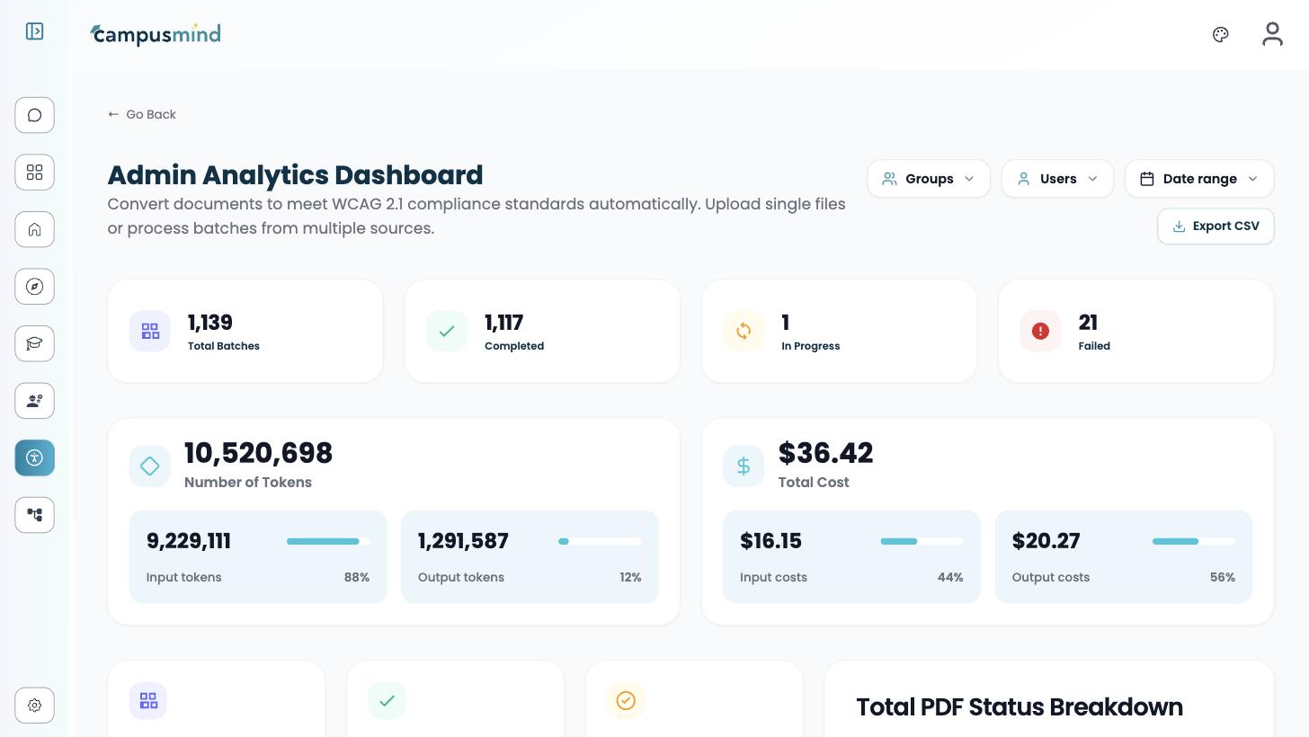
| Card group | What it shows |
|---|---|
| Batches | Total batches, split into Completed, In Progress, and Failed |
| Number of Tokens | Total AI tokens, split into input and output with each share as a percentage |
| Total Cost | Dollar cost, also split into input and output |
| Volume | Total PDFs processed, total pages, and the overall success rate |
| Processing | Total data processed, and average processing time per document and per page |
| Documents Overview | Documents that pass, documents that Need Manual review, the accessibility validation pass rate, and the Avg before score / Avg After score pair |
The scores are the same PDF/UA-1 validation scores you see on a single document, averaged — the before/after pair is the clearest one-line summary of what remediation changed.
Beside the cards, the Total PDF Status Breakdown panel shows a donut chart of every processed PDF by status — Done, Failed, and In progress, each with a count and percentage around the overall success rate — and an Active users this month strip with unique users, average document size, and total corpus.
Pipeline breakdown
Further down, the Pipeline breakdown compares the two remediation strategies side by side. The labels match the product's other naming: Preserve Layout (Auto-Tag) and Full Remediation (Full Reconstruction) are the two strategies from Upload & remediate.
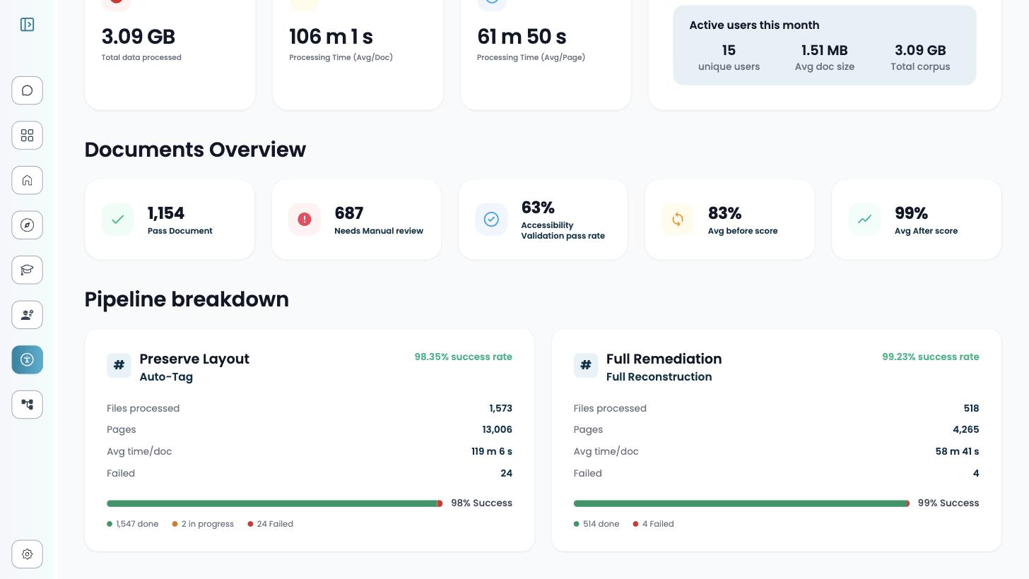
Use this view to sanity-check your strategy mix — for example, whether the documents going through full reconstruction are the ones that actually need it.
Cost and tokens
Usage is measured by AI processing: token counts and dollar cost, each split into input and output. Under the hood, every reconstruction and auto-tag call is logged per file with the model, the input and output tokens, and the cost — tagged with the tenant, user, batch, and pipeline it belongs to. That per-file record is what the dashboard totals and the CSV export draw from.
Filtering
Three dropdowns at the top right scope every figure on the page: Groups, Users, and Date range. Date controls include Last Day, Yesterday, and Last 30 Days, plus a custom range.
Filtering by group is how you attribute cost to a department; filtering by user or date answers "who ran what, when" without leaving the dashboard.
Export CSV
Export CSV, next to the filters, downloads the current view — so set your filters first, then export. The export contains every metric the dashboard shows, not a summary subset. This is the route for chargeback or internal reporting.
For an audit, pair the export with the per-document evidence: the CSV covers the institution, while a document's version history and its downloadable before-and-after report cover the individual file.
Related
- Upload & remediate — the strategies and statuses the dashboard counts.
- Set up your team — the roles and groups behind the filters.
- Version history — the per-document record, and its limits.
- FAQ — short answers on cost and reporting.